QR Code Case Study: Big Green Egg
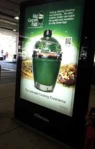
Posted on by Timothy Boyle I was on my way home from a wedding this past weekend and was on the last leg of my trip after arriving at Boston’s Logan Airport Sunday evening. As I made my way to the scheduled bus arrival area I looked to my right and noticed an advertisement for the ‘Big Green Egg’. At that moment I thought to myself how many people have told me that I need to get one of these things and yet I had never actually even seen one before. Luckily the people at Big Green Egg made the intelligent decision of putting a QR code on this advertisement and I can now say that I now know everything I could have wanted to know about the product.
Enticing Customers to Scan Your QR Code
This is one of the rare occasions where almost everything was done right by the people who put together this marketing and QR code campaign; a great site to see.
First off, the actual advertisement was in a perfect location seeing that it is right next to where thousands of people wait every day for long periods of time for their scheduled bus, giving it great visibility. This is particularly great if you actually want to have your QR code scanned too. In fact as I stood there for around ten minutes I saw three different people scan the QR code. A very good sign.
The QR code itself is a decent size so that it stands out enough, has a low density, and a wide margin for easy scanning. The call to action, “Prepare to Get Hungry,” is a decent call to action and will certainly entice some people to scan the code.
Delivering an Engaging and Positive Experience
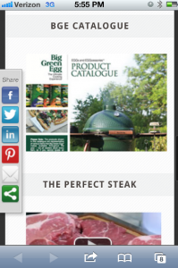
 Upon scanning the code you are taken to a mobile optimized landing page with every bit of information you could possibly want. The landing page seems to combine their blog with social media and other relevant information. There are videos to help you learn how to use the Big Green Egg, how to cook the perfect steak, why they choose to use independent dealers to sell the products, where those dealers are located, recipes, pricing, and much more.
It may not be the greatest looking landing page, but the fact that it is optimized for mobile and does a great job providing the type of things most consumers would be looking for means it couldn’t have been improved a whole lot more.
Everything about this QR code campaign was done well, from the QR code itself, to the location, the landing page and even the content. This is the type of QR code campaign that companies should look to as a great example for their own. I am not sure if the Big Green Egg was tracking their QR code scans and gathering all relevant data from the mobile landing page usage but one would suspect they are since they did everything else right. If not though, using a platform that integrates analytics into everything else is a smart way to manage your QR code campaign.

