Boy Scouts do QR Codes: A Case Study
Posted on by Timothy Boyle When I was a young boy I remember laboring hard by doing my rounds in the local neighborhoods trying to sell the various popcorn flavors we used to fund our local scouts. I hated it. And rarely did I get many sales. So instead I lobbied my father to sell for me at his offices in Boston. I never had to work at popcorn selling again. The Scouts taught me much about efficiency. But I hadn’t seen the Boy Scouts popcorn in long time. In fact the last time I remember seeing the popcorn offered by the Boy Scouts it came in a tin. So I picked up my first bag of kettle corn Boy Scout popcorn today (in partner with Trail’s End) and you wouldn’t believe my surprise when on back of the zip closed bag a QR code was staring back at me on their product packaging! Who knew the Scouts were so technologically advanced?
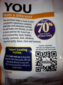
On the back of the bag there is a large, clear QR code with the Trail’s End logo in the center, just asking to be scanned. Already this sets the QR code up for success.
The call to action is clear and indicates the purpose in scanning the code. It’s as if the QR code is saying “If you want more of your delicious popcorn all you have to do is scan me! It’s THAT easy!” This is close to a perfect QR code use. For me personally, I know that after just one bite of that kettle corn I would want more, and instead of tracking and then chasing down a local boy scout all I needed to do was scan the back of the bag and ship more of this delectable popped corn to my house. That should surely drive some internet sales. Genius.
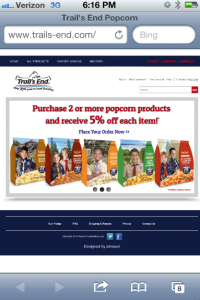
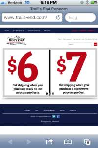
 Here is where the first (and only) issue arises. Once I scan the code I am directed to a desktop website rather than a mobile website. This is sure to turn some people off, life myself. A desktop website is hard to navigate, particularly when you are attempting to make a purchase. So here, the only improvement I would make to this code/landing page is to ensure the page is mobile-optimized, especially the check out phase.
The content of the site however is actually quite good. In fact what stands out right away are the deals and specials that are available if you order online, and they scroll across the screen. The first one gives you 5% off your order, another gives you flat rate shipping no matter the size of your order, and the last one lets you donate to a Support Our Troops cause where your donation is given to the local Scouts organization and popcorn is sent to the troops stationed overseas. These deals and specials are sure to help drive sales once someone scans the code, and particularly because they are so clear and the focus of the page.
 The Boy Scouts, through Trail’s End, have done a great job with the technical aspects of their code as well as the function and purpose. This is a great case study to learn from. Your code or usage doesn’t need to be anything outrageous or ultra creative (though that is often better), but as long as it makes sense and is purposeful you can have a successful QR code campaign.
To make your campaign and management run smoothly and make everyone’s life easier, be sure to check out our platform here.

