Example of the Importance of Mobile Optimization: Lost Sales
Posted on by Timothy Boyle Yesterday was Black Friday and like everyone in America I opened up my email to discover my inbox littered with advertisements from every retailer I had ever patroned. And like most people these days, I was viewing said emails on my phone.
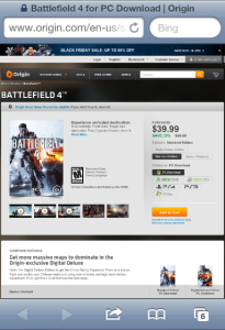
I’m not a big shopper so I began simply deleting all of the advertisements, but one caught my eye; an ad for the video game ‘Battlefield 4’ at 50% off. This was a deal I could not turn down, and so I began the purchasing process on my Iphone.
What occurred next was the perfect example of why you MUST make sure your website is mobile optimized.
The landing site was clearly not mobile optimized but I was still able to add the game to my shopping cart, click the proper game console, and then hit the ‘proceed to check out’ button with only moderate trouble (though certainly enough that a small percentage of people would have given up at this point).
This is where things got difficult though. I began entering in my credit card info, but the way the interface was organized it caused me to miss a bunch of information since the input components were hidden and unless you knew they were there you weren’t going to find them. So I filled in what I saw and then hit submit.
Error messages pop up, telling me I missed some information. I go back and try again, realizing I missed a column of inputs that I would have found if I scrolled right, but was never aware of because of the way it was organized. I hit submit again.
Error message again. I go back to realize there was a single input field even further right on the screen that I had not noticed. At this point I am starting to get very frustrated. I hit submit again.
This time I succeeded. Only took me 30 minutes, no biggie. Next though, it asked for shipping info. This time I was at least more careful to note that some information might be far off the original on-screen content so I scrolled as far right as I could and was able to make sure I filled out every input field there was. Success.
I then advanced to the next stage, choosing my preferred shipping and confirming the purchase. Of course the screen is again confusing and hard to understand but with a bit of playing around I am able to get the drop-down menu for the shipping and eventually hit submit to confirm my purchase.
“Error. You timed out, please try again.” What?! You have got to be f-ing kidding?!? I was ready to lose it at this point. Clearly I was not about to go start this whole 45 minute process again. So instead I said “screw your game and screw this damn interface, I refuse to attempt this again and I refuse to buy your game,” and a sale was lost right then.
This is why you NEED to have a mobile optimized website that is easy to use, quick, and clean. Otherwise there is a 100% chance you will be losing out on sales in the exact way I just described. There is no excuse this far into the 21st century to not be mobile optimized.
If you like making your customers happy (or at least prefer not to piss them off), and if you like more sales to less sales, then make a mobile site. You can use our platform to do so.

