How to Make Your QR Code Better
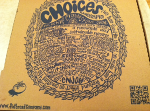
Posted on by Timothy Boyle I ordered pick-up from Flatbread—my favorite local pizza place—this past weekend, and after I got home and stuffed my face with my paleo cheat meal, I noticed that the box had a large QR code on it. Obviously I had to scan it. What I found was a perfect example of how a lackluster QR code can be made much better.
What I noticed first off with this particular QR code is that it lacked a call-to-action. A QR code without a call-to-action is almost always unadvised. The call-to-action is generally what convinces someone to scan your code in the first place, so to not have one means you will see drastically lower scan rates.
To fix this you obviously need to put a call-to-action next to the code, but a call-to-action that says something like “scan the code” is not going to cut it. What you want is a call-to-action that clearly states the benefit someone will receive if they scan the code—like “Scan here to receive a free music download!”, or “Scan here to download the app!”—or that appeals to their curiosity and makes them want to find out what is on the other side of the QR code.
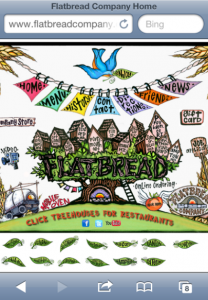
 After scanning the QR code on the Flatbread pizza box I was then taken to their beautiful desktop website. However, despite their fantastic looking and creative desktop website, this is another area where this particular QR code (and many other QR codes I see on a daily basis) can get better.
First off, the desktop site is hard to navigate on a mobile phone, particular the Flatbread site. Since more than half of Americans own smartphones you need to make sure you have a mobile site to go along with your desktop site, and the QR code should be directed to the former not the latter. Not doing this means far fewer people who scan the code will actually stay on your site.
Second, make the landing page from your QR code actually relevant or interesting to the customer. In this particular case what good does it do me to be taken to the Flatbread desktop site? There is really very little there I might be interested in since I’ve clearly already ordered, know the location to pick up my order, and have seen the menu. Instead what could have been done here is have the QR code point you directly to information about the various ingredients; perhaps where the organic meat or vegetables are from, or how the food is prepared. Or perhaps the QR code would direct you to a coupon where you could either save it on your phone or print out for the next time you order, this might incentive a larger number of future orders, and provide a mutually beneficial experience.
There are many possible ways to improve your QR code use, but these few are incredibly important (assuming you have all the technical best practices already taken care of). Just make sure your call to action is one that will interest people enough to scan your code, and that your landing page is relevant to the person who has chosen to scan your code. Give the customer something they want, and create a code that leaves both parties better off for taking the time to scan. It’s as simple as that.

