QR Code Case Study: GNC
Posted on by Timothy Boyle Much can be learned from looking at real life examples of QR code campaigns. Often times if you scan a code you will quickly learn what not to do, sometimes you might even learn what you should do, but at worst these examples should help jump start your brainstorming about how you might be able to benefits from your own QR code campaign—but of course since you are reading this blog yours won’t have any of the problems I am so often pointing out.
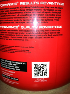
On a typical day I consume two servings of GNC protein powder; it keeps me full and helps ensure I keep my ripped frame. So I recently purchased one of the new GNC protein powders and noticed the QR code on the back, obviously I had to scan it. The final product was not nearly as good as the protein powder itself.
The good news about this QR code campaign is that we can all learn what NOT to do when deciding to use QR codes, particularly on product packaging.
Before I point out the parts of their QR code use that were poor they did do a couple of things right, or at least sort of right. First off the QR code itself is done well with low density and a nice border, ensuring a quick and easy scan for most smartphones. Good job. Second, they used a call to action to try and convince people to scan the code—though it wasn’t a very enticing one, so not sure how well it will work.
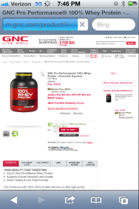
 The areas that we can all learn from are twofold. First, the call to actions says to “learn more, scan here” and then takes you to a landing page for the protein shake itself. Now this might be fine but for a couple of reasons. The protein packaging itself gives you most of the information that is contained on the landing page, so in that regards you are learning very little that you didn’t know. Also, we are talking about a simple protein powder; do you really think anyone wants to “learn more” about it than they already know? I mean they either already purchased it or are considering purchasing it in the store and standing nearby is a GNC employee. This is certainly not an ideal use for a QR code.
An alternative to this lousy QR code use could have been something like offering a coupon or free shipping if they purchase their next protein powder right there from the landing page, or perhaps they could use the QR code to advertise a special deal for a sister product to cross-advertise and help drive their online sales. This would be a much better use of a QR code as it would help drive sales, and makes scanning the code worthwhile for the consumer. Just make sure the call to action for the QR code explains what they will get from scanning the code.
The other major issue with the code—and something I still see all the time for some reason—is that the landing page was simply their desktop website. This is really inexcusable at this point in time. Mobile makes up a large portion of all online traffic and therefore every business, particularly large ones who sell online like GNC, must have a mobile optimized website and landing pages. Attempting to use a desktop website, especially if you are trying to buy something online, is incredibly frustrating and you will likely lose many potential customers by doing this. So if you are going to use QR codes—or even if you don’t—make sure your mobile users are directed to a mobile optimized website. The small investment will be worth it.
If you are going to use QR codes it is vitally important that you give the consumer a reason to scan the code, make it clear with a call to action, make sure the code is easily scannable, and make sure they will be directed to a mobile optimized landing page. In addition to these things you should also be using a platform that allows you to make changes to your codes on the fly, has tracking and analytics, and lets you manage all of your codes from one convenient place.

