Matador Beef Jerky: A Case Study in QR Codes
Posted on by Timothy Boyle There are thousands of QR codes being used in many different ways and to varying degrees of success and failure, in this blog I wish simply to analyze one of these many QR code uses in order to learn from it and see what was done well, what was not, and what could be done to improve the use in the future. The reader should use this as a way to improve their own QR code campaigns or at least to ensure that their QR codes are indeed being used in the most effective way possible.
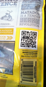
I recently purchased a bag of Matador Beef Jerky, teriyaki flavor of course. As I threw away the empty bag however, it landed with the back of the packaging facing up in the trash and that is when I noticed the QR code staring me in the face. Of course I recovered the empty beef jerky bag, scanned the code and took some photos.
Looking at this particular case study you will see both the good and bad of a typical QR code marketing campaign.
First off you might have noticed there was a problem when I proceeded to throw away the bag without having even noticed the QR code, and I am someone who is always looking out for them, so imagine how many other consumers just as easily glance over the code. The problem here was that the QR code just doesn’t jump out. Perhaps because there is too much clutter, but also because the code seems like it was simply an afterthought. It is important that if you are going to use a QR code you make it look important.
This also brings me to my next point. The marketer also failed to include an interesting and easily visible call to action. If you want consumers to actually scan your code, tell them to scan it! And even more than that, tell them why they should scan it; what is in it for them? This is vitally important if you want your QR code campaign to be a success.
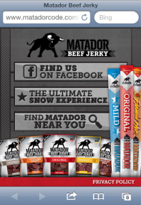
 Beyond this, Matador Beef Jerky did very well with their QR code campaign. Once I, or the consumer, scanned the code, they would be taken to a beautiful and simple website, optimized for mobile phone viewing. Having a mobile optimized website is greatly important if you wish for the consumer to remain on the site.
There were only a few options of what the visitor could do, making it clear what Matador was hoping their consumer would do, and ensuring the consumer is likely to only do those things. In this case finding them and liking them on Facebook, and finding locations near where the consumer lives so they can find and purchase more Matador Beef Jerky (it is really good by the way, and worth finding out what stores in your area sell it).
The landing page itself was very well done, looked great and was very simple, greatly enhancing the credibility of the company.
This particular QR code use is great when it comes to the things that matter AFTER the QR code is scanned, but the problem is that very few people will likely scan the code if the design and incentives aren’t there to convince people to scan the code in the first place. The before and after part of scanning a QR code are of equal value and you can’t have one without the other.
For help on ensuring you adhere to QR code use best practices click here, or to ensure you are using a platform that will help you achieve most of the advised best practices with as little amount of work and for as little amount of expense please visit here.

