Fast Food Does QR Codes: Part 2 Taco bell
Posted on by Timothy Boyle Anytime I go out in public these days it has become an almost definite fact that I will see at least one QR code, and quite possible many more than one. On the one hand this is something I am happy to see, as it means the technology is really growing and people are beginning to understand its potential. On the other hand, however, I still find that the vast majority of these QR codes are done in an unsatisfactory way or quite often far worse than unsatisfactory. A recent trip to Taco Bell/KFC might help to illuminate what I mean.
While getting a tasty meal at the local Taco Bell/KFC joint, I was hit on three different occasions with QR codes on their product packaging and receipt. Product packaging is obviously a perfect location for QR codes since everyone must interact with the packaging after they make the purchase in this case. They also placed a QR code on my receipt; a very interesting placement for a QR code with many possibilities. But not all three QR codes were made equally, and it is this that inequality that I wish to examine here so we might see the good and bad of QR code use.
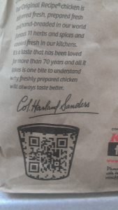
The first code I scanned was a code on the KFC bag (for some reason they didn’t give me a Taco Bell bag despite ordering only Taco Bell). This code was placed over what appears to be a bucket (for KFC I would guess), making it slightly hard to scan, but a creative placement nonetheless. There is no call to action, so there is nothing enticing a customer to scan, unless they are simply curious. This is a serious no-no. You should almost always use a good call to action. The next let down for me was upon scanning the code being directed simply to their homepage, though it was at least mobile optimized. There was no targeting the customer, or providing any sort of interesting interface, or information. Just a boring mobile site. Far from ideal.
 A better use of this code might have been to direct customers to give their feedback about the particular Taco Bell they were in and the type of service they received. This data could then be collected and used as a way to improve customer service and experience in the future.
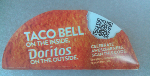
The second code I scanned was on the Taco Container. What I love about this code is how much it stands out, almost like they had some great purpose for the code. My one problem with the physical code is that they put a small bell in the code making it hard (or sometimes impossible) for some QR code scanner apps to scan the code. With this code there is at least some sort of call to action telling you to “Celebrate Awesomeness, Scan this code.” Upon scanning you are taken to the Taco Bell Facebook page, where I suppose they are hoping you will ‘like’ them. Perhaps instead of the call to action they chose, or in addition to it, they might have said “Like us of Facebook. Scan here,” so there wouldn’t have been any confusion as what they meant. This sort of social media connection to QR codes is a great way to generate free advertising, you just need to incentivise the customer correctly.
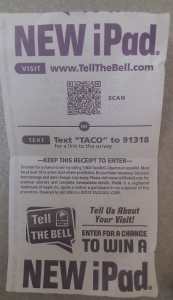
 The last code I scanned was on my receipt. The best use of a QR code of these three by far. This code has a great call to action, offering a chance to win a prize (an iPad) by scanning the code and filling out a brief form to enter. This is a great targeted use of a code and offers something to the customer, while also gathering information that can be used for future marketing and advertising campaigns.
QR codes have a lot of potential but they need to be used correctly. Every time someone scans a QR code that is done poorly they decrease the odds of that person scanning another QR code in the future, whether yours or another company’s. Do everyone a service and QR code appropriately. Using a platform that helps ensure you are using them correctly is always a good place to start.

