Avoid Penalties from Google's April 21 Mobile Ranking Updates
Posted on by Mike Caha
In this post, we’re going to cover how to ensure you don’t get left behind in the dust with Google’s April 21st, 2015 “Mobilegeddon” update. Google will “[expand its] use of mobile-friendliness as a ranking signal” and if you don’t have a mobile website (or an improperly configured on) your search engine optimization (SEO) rankings will suffer. Here it is straight from Google:
If the desktop and mobile version of the page are treated as separate entities, both desktop and mobile URLs can be shown in desktop search results, and their ranking may be lower than if Google understood their relationship. – https://developers.google.com/webmasters/mobile-sites/mobile-seo/configurations/separate-urls
Pay attention to this Google update if you fall into either of these two groups.
- Website owners that currently don’t have a mobile-friendly website who want to avoid to the typically lengthy, expensive, and complex undertaking of creating a responsive website and can instead build a stand-alone, feature-rich, and mobile-compliant website in minutes with the Qfuse Mobile Website Builder. Alternatively, responsive web design services are also available to develop a single site that will scale across all devices – from desktop down to tablet and handheld smartphones.
- Anyone currently using a stand-alone mobile website that has not yet “linked” their mobile and desktop sites together in the eyes of Google.
If you’re unsure whether your website is mobile-compliant, you can run a fast and free Mobile-Friendly test by Google to see where you stand.
What is a “stand-alone” mobile website?
A stand-alone mobile website is typically a non-responsive website is distinct from it’s desktop/tablet counterpart and often times has a separate URL (as in the graphic below, courtesy of Google).

If you’re wondering how responsive websites differ from stand-alone sites, responsive websites adapt themselves to mobile devices based on end-user’s device screen resolution (viewport size). Stand-alone sites are distinct and separate from their desktop counter parts. The key benefits of stand-alone sites include:
- Faster Load Times: Website files and images that are optimized for mobile-only use are smaller in size and therefore have faster end-user load times (which typically improves important conversion and usability factors like bounce rates).
- More Engaging Content: Length of content always a concern for mobile devices (think less-is-more mentality). By having a separate mobile page you have the option to trim down content length to better engage and convert mobile users.
- Fast and Easy: Using a tool like the Qfuse Mobile Website Builder allows anyone to make a stand-alone mobile website in minutes. Making it a much faster and more affordable option to responsive website design.
How Do I Link My Desktop & Mobile Sites to Keep Google Happy?
The short answer is to create signals in your website code to specifically tell Google that your individual mobile and desktop pages are related and equivalent. How can you do this? Let’s dive into that next.
Let’s say you have a desktop page (http://www.website.com/page-a) and an equivalent mobile page (http://m.website.com/page-a) you would want to add the following code within the <head> tag of the respective pages.
Desktop (http://www.website.com/page-a)
<link rel="alternate" media="only screen and (max-width: 640px)" href="http://m.website.com/page-a" >
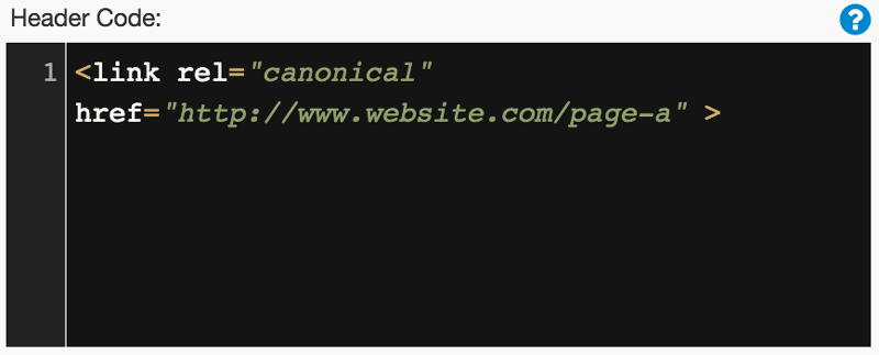
Mobile (http://m.website.com/page-a)
<link rel="canonical" href="http://www.website.com/page-a" >
2 Rules to Keep in Mind
- Maintain a 1-1 ratio between mobile and desktop pages. When using the rel=”alternate” and rel=”canonical” markups, don’t point multiple desktop pages to one mobile page. Only point one mobile page to one desktop page and vice versa.
- Double-check your redirects. Be sure that your rel=”alternate” and rel=”canonical links don’t point to their parent page (the page you put the code in) or to an unrelated page.
Linking a Qfuse Mobile Site to Your Desktop Site
If you don’t already have one already, you can sign up for a Qfuse Pro account here. Once you have an account, follow the steps below to link your desktop and mobile sites to keep Google satisfied while simultaneously improving your search engine rankings.
Step 1: In the Qfuse Editor, click on the relevant page.
Step 2: Expand the “Edit Page-Level Settings” section and notice the “Header Code” area.
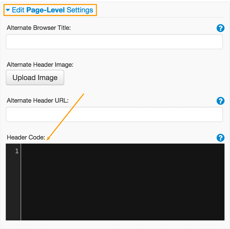
Step 3: Enter the MOBILE code in the “Header Code” section and click Save Update.
Step 4: Don’t forget to enter the DESKTOP code on the relevant desktop page in the <HEAD> tags.
Below is the code format you will need to use (replace http://m.website.com/page-a with the link to the appropriate Qfuse page).
<link rel="alternate" media="only screen and (max-width: 640px)" href="http://m.website.com/page-a" >
Now you’re all set to go and ready to take advantage of Google’s upcoming mobile update and avoid being penalized. Nice work!
